I recently got into virtual photography, which is taking photos inside video games. Editing my shots is what made me realize how little I understood about color, so I decided to dive into the topic with Claude and fill the gaps in my knowledge.
In my previous post, Exposure vs Brightness, Claude helped me measure and understand what the Exposure and Brightness sliders do to a pixel. Along the way I wrote that a pixel is three numbers from 0 to 255, and then added a throwaway line about a “Pandora’s box of color profiles and color spaces” that I couldn’t close again. This is me opening the box.
The question I should have asked first is a simple one: what does 255 · 0 · 0 actually mean? Everything below follows from it:
- What is a color space? Is sRGB one? What does the “s” stand for?
- Why can the same three numbers be two different colors?
- If a screen can’t show a color, why not just use more bits?
Short version: RGB 255 · 0 · 0 is not a color. It’s an instruction (“turn the red light all the way up”), and which actual red you’ll see depends on the screen.
Disclaimer: I’m learning color by doing it, with Claude as my guide, so some of this may be wrong. I’ve marked what Claude explained to me and what we checked in code. If you spot a mistake, please tell me in the comments.
You can play with every number in this article. The small widgets do the real math, and Claude and I recomputed every number in the text in code, so nothing was just copied from a chat.
Key takeaways:
- An RGB triple means nothing until you know its color space.
- A color space is the contract that says what the numbers mean: which red, green and blue, which white, and how numbers turn into light.
- A color profile is the label that says which color space is used. It’s a small file embedded in an image, or describing a screen.
- A gamut is the colors you can mix from your three paints. On the map of visible color it’s a triangle, and a screen can’t leave it.
- Same numbers, different color: sRGB red in P3 numbers is not
255 · 0 · 0.- More bits give finer steps, not new colors.
What is a color space? Why is it called sRGB?
Here’s where my mental model broke. I had always imagined 255 · 0 · 0 as “red”. But what you see depends on what the red light in your screen actually is. A color space is the contract that pins down what the numbers mean. It fixes three things:
- The primaries: exactly which red, green and blue, as measurable points. “Full red” means a specific, physical red. Picture the tiny red diode (subpixel) in your display: full red means that diode at full power, and it glows one particular red. Another display can have a slightly different red diode.
- The white point: what
(1, 1, 1)looks like. White isn’t one fixed color. A sheet of paper looks warm under a candle and bluish in the shade, so a screen has to pick which white it means. Most spaces pick D65. It’s just the name of a standard white, roughly midday daylight. The “D” is for daylight, and the 65 is its color temperature, about 6500 K. - The transfer function: how stored numbers map to amounts of light. This is the 2.2 “gamma” from Exposure vs Brightness: a stored 0.5 is only about 21% of the light, not 50%. I’m not going to repeat that here, but it is the third clause of the contract.
So “RGB” on its own is a family. sRGB, Display P3 and BT.2020 are members of it, each with specific values filled in.
The “s” in sRGB stands for standard. HP and Microsoft made it in the 90s, based on what typical monitors back then could show. HDTV uses the same primaries. Nearly everything on the web assumes it: an image with no color profile attached (more on profiles below) is treated as sRGB.
A map of color, and the triangles on it
Here’s the second thing that blew my mind. In 1931 scientists made a map of human vision. Plot every color a person can see on a flat chart, with brightness taken out, and you get a horseshoe-shaped region. For now just take it as a map.
Okay, but two things bugged me right away. Why is the horseshoe sitting exactly there? Why isn’t a corner at 0,0, and what are x and y even?
So I asked Claude. Turns out this map doesn’t use red, green and blue. It describes a color with 3 other numbers: brightness, and x and y. Fix the brightness at one level, draw only x and y, and you get the horseshoe. That’s also why it’s not like the RGB I’m used to, where 0,0 would be a corner. x and y aren’t “how much red” and “how much green”.
And how do x and y work, and why is there dead space outside the horseshoe? The high-level answer is above: the horseshoe is every color a person can see, so outside of it is stuff our eyes can’t see. But why it has this exact shape, and how x and y work? Magic for now. I want to understand it too, so we’ll dive in next time in Why the map of visible color is a horseshoe.
A screen mixes three lights. Any mix of three points lands inside the triangle they form.
Gamut. I first heard this word in Android talks (Romain Guy used it a lot, haha) and I pretended I understood it. Then I got into color, it was everywhere, and I was super confused. Finally, with the help of Claude, I got the real meaning (at least I hope).
Picture a paint box with three tubes: red, green and blue. Everything you can mix from them is the box’s gamut. A wide gamut doesn’t mean more tubes, it means stronger ones. A redder red, a greener green.
So a color space’s gamut is a triangle on this map. Here are the three I’ll keep mentioning:
- sRGB: the small triangle. The internet’s default, and what almost every screen can show.
- Display P3: wider red and green. It comes from digital cinema and it’s what recent iPhones and Macs show.
- BT.2020: red, green and blue corners almost on the edge of the horseshoe, because its primaries are single wavelengths of light. It was built for UHD and HDR video, and few displays reach all of it.
Claude helped me compute how much of the horseshoe each triangle covers: roughly a third for sRGB, almost half for Display P3 and about two thirds for BT.2020. You’ll see other figures online depending on how you measure, so treat these as ballpark.
For nerds: the exact primaries
These are the published values; I use them in the widgets. White is D65 at (0.3127, 0.3290) in all three.
| Space | Red (x, y) | Green (x, y) | Blue (x, y) |
|---|---|---|---|
| sRGB | (0.640, 0.330) | (0.300, 0.600) | (0.150, 0.060) |
| Display P3 | (0.680, 0.320) | (0.265, 0.690) | (0.150, 0.060) |
| BT.2020 | (0.708, 0.292) | (0.170, 0.797) | (0.131, 0.046) |
Same numbers, different color
This is where it gets practical. Take pure sRGB red, 255 · 0 · 0. Written in Display P3 numbers, it is #EA3323. And P3’s own 255 · 0 · 0 is a red that sRGB can’t show at all. It’s purer than sRGB’s red, so you’d have to take away a bit of green and blue to get there (negative green and blue), and you can’t have less than no light.
I got curious and asked Claude: why do we only talk about negative green and blue? Can’t the red go above 255 too? Turns out it can, P3’s red needs a bit more than full red. But that’s the easy problem. Dim everything a little and the red fits. Green and blue are stuck, because they’re already below zero and dimming doesn’t change that. So too much red is just too much brightness, and the negatives are what make the color impossible.
Back to the reds. The same three numbers really are two different colors:
If your screen is wide-gamut (most recent iPhones and Macs), the second swatch is visibly more vivid. If it isn’t, the widget tells you so, because there’s nothing to see.
This explains the “washed out” and “oversaturated” bugs everyone runs into when the color profile is wrong or missing:
- sRGB numbers read as P3: every color gets stretched outward. Oversaturated, sunburnt skin.
- P3 numbers read as sRGB: every color gets pulled inward. Dull and flat.
Here is what each one looks like. I took two of my own PS5 screenshots and, with the help of Claude, simulated the mix-up in code with the real sRGB and P3 numbers. It’s a simulation, not a screenshot of a broken app. In both pictures the left half is the correct one and the right half is the mix-up.
First, sRGB numbers read as P3:

Left: correct. Right: sRGB numbers read as P3.
The right side might look better at first glance, with its punchier colors. But it’s the wrong one. Those aren’t the colors the game made. The skin goes sunburnt, and the strongest colors hit the limit and get clipped: in this picture about half of the strong reds are cut off, so the detail in them is gone. That matters when I edit: colors that aren’t clipped I can still work with, but once they’re clipped there is nothing left to pull back. More vivid is not more correct. The whole point of the contract is that everyone sees the colors the creator picked.
Now P3 numbers read as sRGB:
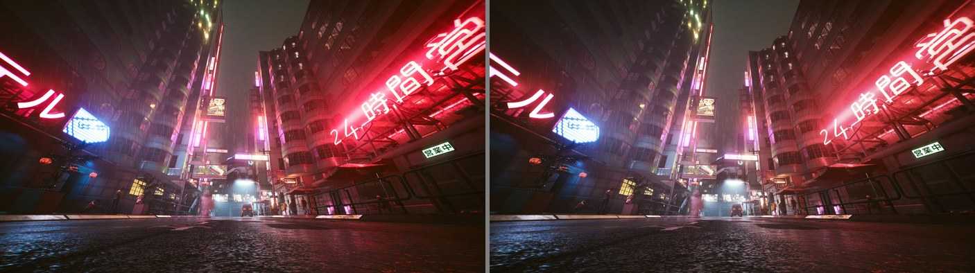
Left: correct. Right: P3 numbers read as sRGB. The effect is subtler this time, so compare the neon signs.
It’s not only sRGB and P3. The video clips from my PS5 are HDR. They use a much wider gamut (BT.2020) and a different curve for brightness. If a player or editor reads them as ordinary sRGB video, they come out washed out and grey. It’s the same bug with a different contract: this time the curve (the third clause) gets misread, and the primaries too.
Same trap when I export for Instagram. The file needs sRGB embedded in it, or Instagram flattens and desaturates the image.
Profile vs space
A small point that confused me. The color space is the contract (primaries, white, curve). An ICC profile is a small file embedded in an image, or describing a device, that says which contract applies. The system reads the image’s profile and your monitor’s profile and converts between them, so what you meant is what you see.
The screenshots I work with are JPG and PNG files from my PS5. They carry no HDR information and no profile at all, so sRGB is implied, and that’s what I should be grading for.
Claude explained the rest of this section to me. I haven’t tested it myself.
So what happens when things don’t match? Two cases.
The screen can’t show the image’s space. Say a photo is in P3 and your screen is sRGB. The system still converts it, but it can’t reach the most vivid colors, so it moves them to the closest ones the screen can do. The photo looks a bit tamer, but nothing is broken.
The software doesn’t know the profile, or there isn’t one. Then it guesses, and usually it guesses sRGB. That’s fine most of the time, since most photos are sRGB anyway. The trouble starts when the guess is wrong, and that’s the washed out and oversaturated stuff from before. Some older apps don’t even check, they just send the numbers straight to the screen.
And then there’s print
This is actually where I first ran into all of this, way before I became a software engineer. I’d print photos from the Internet, or ones I took with my camera, after editing them in Photoshop. And the print never exactly matched what I saw on screen. Maybe it was the printer, maybe a color profile, who knows, it was years ago. I had no idea why. Now I (kind of) do.
Claude explained the rest of this section to me. I haven’t tested it myself.
A screen makes color out of light. Paper doesn’t glow, it just reflects the light in the room, and a printer mixes inks, so it’s a different paint box. Bright vivid blues, greens and oranges often don’t exist in ink, so the printer squeezes them to the closest color it can make. And the brightest thing on paper is the paper itself, so the whole photo feels darker and flatter than on a glowing screen.
It’s the paint box idea again, except now it’s literal paint. It’s not even a clean triangle anymore, more of a lumpy shape.
Why isn’t more bits enough?
At this point I asked the most engineer question of the whole journey: if sRGB can’t make P3’s red, why not just give each channel more bits? Instead of 256 levels of red, 65,536. Surely more precision covers everything.
It doesn’t, and the reason helped everything click. Bits give finer steps, not a bigger gamut. They are two independent things.
For nerds: the ADC analogy
This is how Claude explained it to me, in terms I know from electronics.
A 24-bit analog-to-digital converter with a 0 to 3.3 V reference can resolve microvolts, but it can’t measure 5 V. Bit depth is the resolution; the reference voltage sets the full scale.
In RGB, the primaries are the reference. (1, 0, 0) means “the red emitter at full power”, and that red has a fixed physical spectrum. 8 bits gives you 256 steps between off and that red. 16 bits gives you 65,536 steps between off and the same red.
Here is that in pictures. Every dot is one color you can make by mixing the three primaries in whole steps (equal steps of light, plotted on the same map). First, more bits with the same primaries:
More bits, denser dots, the exact same triangle. Now the opposite: the same number of steps, but moving the primaries outward:
Same dots, bigger triangle, so each step is coarser. Two different knobs.
That second picture also hints at a catch. 8 bits gives 256 steps per channel regardless of the triangle, so a bigger triangle spreads the same steps further apart, and you can get banding in smooth gradients. That is why wide gamut and HDR are paired with 10-bit.
For nerds: two simplifications I made
Claude explained this to me.
The real sRGB curve isn’t exactly a 2.2 power. It’s a short straight piece near black plus a power curve, so a stored 0.5 comes out as 0.214 of the light, where a pure 2.2 gives 0.218. That’s why I say “about 21%“.
The dots in the grids above are equal steps of light. Real image files store gamma-encoded steps instead, which are spaced differently: finer in the darks, coarser in the brights. The triangle and the idea stay the same, the dots would just sit a bit differently inside it.
Why the triangle is a hard wall
A pixel is three lights added together. Any non-negative mix of three points stays inside the triangle they form, like a weighted average. To reach outside, you would need a negative amount of one light. Negative light doesn’t exist.
For nerds: the twist, you can write down colors outside the triangle
Claude explained this to me, and then we computed the numbers in code.
I said you can’t reach outside the triangle, but I was half right. With negative numbers (and values above 1), the sRGB primaries can describe any color mathematically. The greenest P3 green, P3 (0, 1, 0), in linear sRGB coordinates is:
(−0.225, 1.042, −0.079)
Formats built for this exist, such as scRGB and Apple’s “extended sRGB”, which use floating-point values. So unbounded floats solve storage. They don’t solve display: no screen can emit −0.225 red.
The real reason for the contract is that numbers eventually drive specific physical lights, and those differ between devices. A color space defines the numbers relative to known primaries, so software can convert them to this screen’s primaries and clip what doesn’t fit.
What I took away
I used to think an RGB number was a color. It’s an instruction. If someone hands me three numbers, I can’t tell which exact color they mean until I know the color space they’re in: which red, green and blue, which white, and which curve. In an image file the color profile is what says it, the label that tells you which color space the numbers belong to. Without one, the software has to guess, and usually it guesses sRGB. And no amount of bits gets you out of the triangle.
Is this information strictly required for my use cases? No. But I just cannot work without understanding the fundamentals. In any of my chats with Claude the terms pop up all the time (AI likes to be nerdy) and it puzzles me, making me feel stupid. Learning this helps to fill the gaps in my mind map and makes the conversations with Claude more level.
What I do differently now: before I worry about a color, I ask what space it is in. For my own work the gamut ceiling that matters isn’t some theoretical limit, it is my screen (P3) and Instagram (effectively sRGB for most viewers).
But this leaves a question I couldn’t stop thinking about. Why is the map that shape? Why a horseshoe, why a curved edge, and why three lights? In Why the map of visible color is a horseshoe I go after that.
Did I get something wrong, or do you think about color spaces differently? The comments are open.
The color series: 1. What does RGB 255, 0, 0 actually mean? (you are here) · 2. Why the map of visible color is a horseshoe · 3. HSL and HSV: RGB with different knobs · 4. Lab: numbers that match what you see · 5. Why gradients go muddy